+10
Problem displaying the interface on the combo button
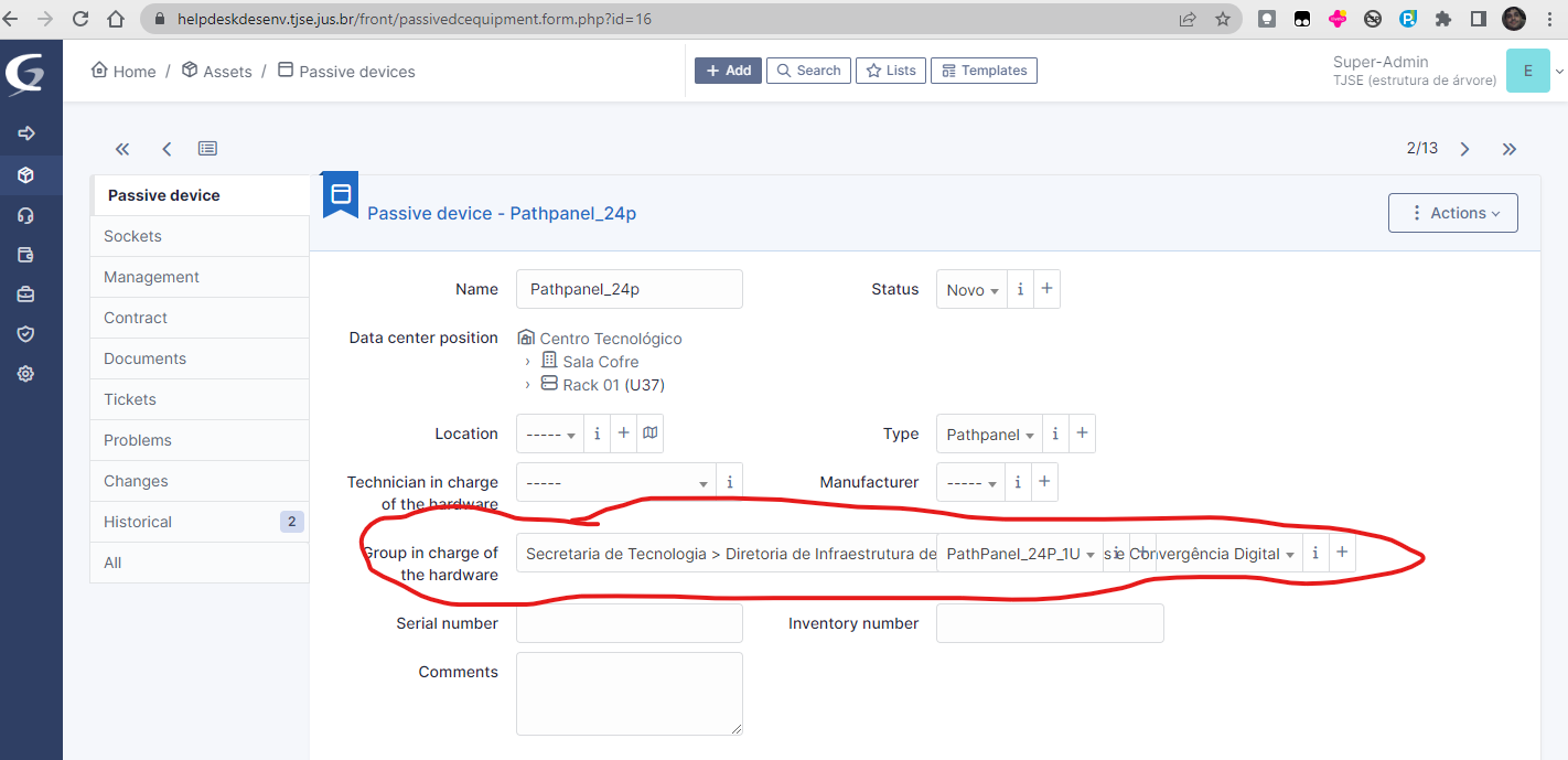
When the string of the item "Group in charge of the hardware" is too large, overlapping the item in the next column.
See the image below:

When reduce the font size by the browser the interface looks like this:

Servicio de atención al cliente por UserEcho


I am fairly sure this was already fixed. Have you checked the latest GLPI 10 release?